LXRInsights
LXRInsights


Timeline
Jun 2025 - Aug 2025
Role
Lead UX Extern
Platform & Tools
Desktop || Figma, Miro, Excel
Skills
Project Management, UX Research
Overview
Problem Statement
Problem Statement
LXRInsights’ dashboard made core tasks harder than they should be. Inconsistent timelines, weak visual hierarchy, unclear labels, and fragmented layouts created friction for users, which revealed the need for a more intuitive, research-driven UX.
Impact
Impact
Usability testing revealed a 37% decrease in task completion time from ~8 minutes to ~5 after our changes, in addition to higher ratings of user confidence in other pages.
Usability testing revealed a 37% decrease in task completion on the experiments page from ~8 minutes to ~5 after our changes, in addition to higher ratings of user confidence in the other tools and pages.
Main Solutions
Main Solutions
Strengthened visual hierarchy for standardization, information architecture, and clearer CTAs.
Used the principle of progressive disclosure to strengthen onboarding of information for tools.
Redesigned data layout for quick scans and deep dives using structured flows and accordion components.
User Tests
Smarter AI, sharper results
Each team member conducted an independent UX audit to identify key strengths and usability issues across the platform, bringing diverse perspectives into the evaluation.
We organized recurring insights with affinity mapping, evaluated usability using Nielsen’s heuristics, and mapped user flows to identify key friction points across the platform.

Design
Wireframing & Prototyping
Redesigned and standardized the platform’s visual system across core pages to create a cleaner, more cohesive experience.
Improved onboarding & info architecture in Experiments, aligned Audience Manager and Predictions with updated structural patterns, optimized analytics for quick insights and deeper data exploration, and established scalable layouts for future tools and features

Research
User & Stakeholder Research
I led stakeholder interviews to align business goals, priorities, and design direction while uncovering key constraints and opportunities that informed product decisions.
Alongside this, the team developed personas, mapped user journeys, analyzed competitors, and refined the platform’s information architecture to improve usability and overall organization.

Initial UX Audit
Initial UX Auditing
Each team member conducted an independent UX audit to identify key strengths and usability issues across the platform, bringing diverse perspectives into the evaluation.
We organized recurring insights with affinity mapping, evaluated usability using Nielsen’s heuristics, and mapped user flows to identify key friction points across the platform.

User Tests
User Tests & Iterations
User testing was conducted with 10 participants across two rounds, measuring task completion time and satisfaction through qualitative and quantitative data.
Final findings, research, and prototypes were compiled and presented in a cross-functional meeting including leadership, with all materials organized for future integration, iteration, and continued testing.

Design
Wireframing & Prototyping
Redesigned and standardized the platform’s visual system across core pages to create a cleaner, more cohesive experience.
Improved onboarding & info architecture in Experiments, aligned Audience Manager and Predictions with updated structural patterns, optimized analytics for quick insights and deeper data exploration, and established scalable layouts for future tools and features

Data and lead generation
Better data more wins
I led stakeholder interviews to align business goals, priorities, and design direction while uncovering key constraints and opportunities that informed product decisions.
Alongside this, the team developed personas, mapped user journeys, analyzed competitors, and refined the platform’s information architecture to improve usability and overall organization.

Initial UX Audit
Initial UX Auditing
Each team member conducted an independent UX audit to identify key strengths and usability issues across the platform, bringing diverse perspectives into the evaluation.
We organized recurring insights with affinity mapping, evaluated usability using Nielsen’s heuristics, and mapped user flows to identify key friction points across the platform.

Overview Page Solutions

Step 1
Visual Hierarchy
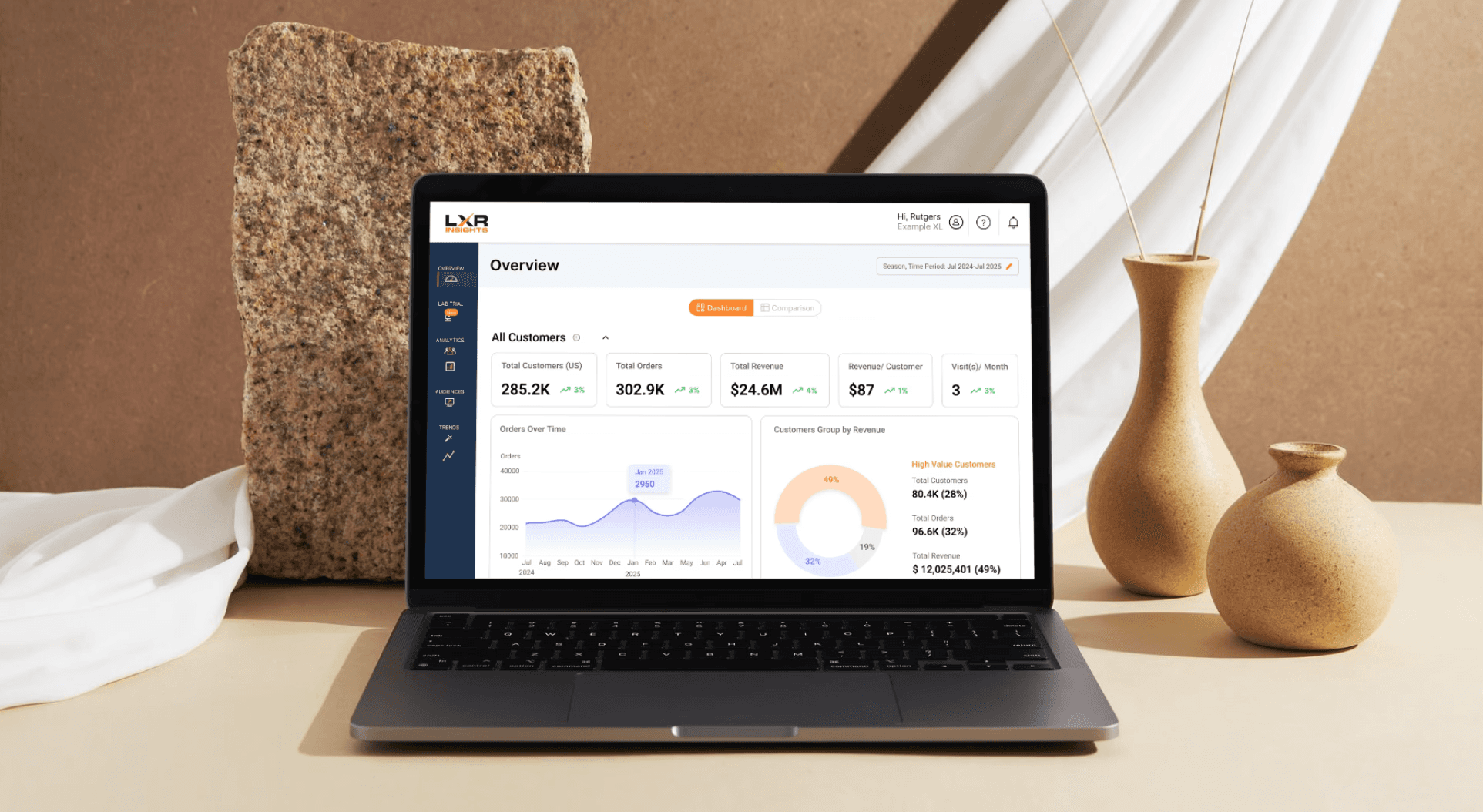
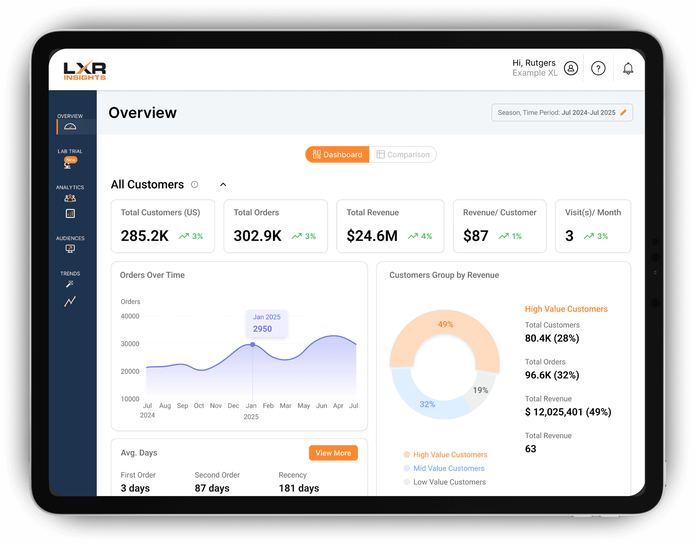
Strengthened visual hierarchy for standardization, information architecture, and clearer CTAs. Implemented an accordion layout to organize clearly with the option to collapse secondary information.
Step 2
Increased Usability
Flexible timeline/date picker included for data selection. The backend is set up to process this.
Step 3
Visual Design
Increased toggle visibility of Dashboard vs Comparison pages to strengthen visual hierarchy. Emphasized the pre-existing three color correlation to the high, mid, and low value customers, and replaced gradients.
Step 1
Visual Hierarchy
Strengthened visual hierarchy for standardization, information architecture, and clearer CTAs. Implemented an accordion layout to organize clearly with the option to collapse secondary information.
Step 2
Increased Usability
Flexible timeline/date picker included for data selection. The backend is set up to process this.
Step 3
Visual Design
Increased toggle visibility of Dashboard vs Comparison pages to strengthen visual hierarchy. Emphasized the pre-existing three color correlation to the high, mid, and low value customers, and replaced gradients.
Step 1
Visual Hierarchy
Strengthened visual hierarchy for standardization, information architecture, and clearer CTAs. Implemented an accordion layout to organize clearly with the option to collapse secondary information.
Step 2
Increased Usability
Flexible timeline/date picker included for data selection. The backend is set up to process this.
Step 3
Visual Design
Increased toggle visibility of Dashboard vs Comparison pages to strengthen visual hierarchy. Emphasized the pre-existing three color correlation to the high, mid, and low value customers, and replaced gradients.
Experiments Page Solutions


Step 1
Simplified Onboarding
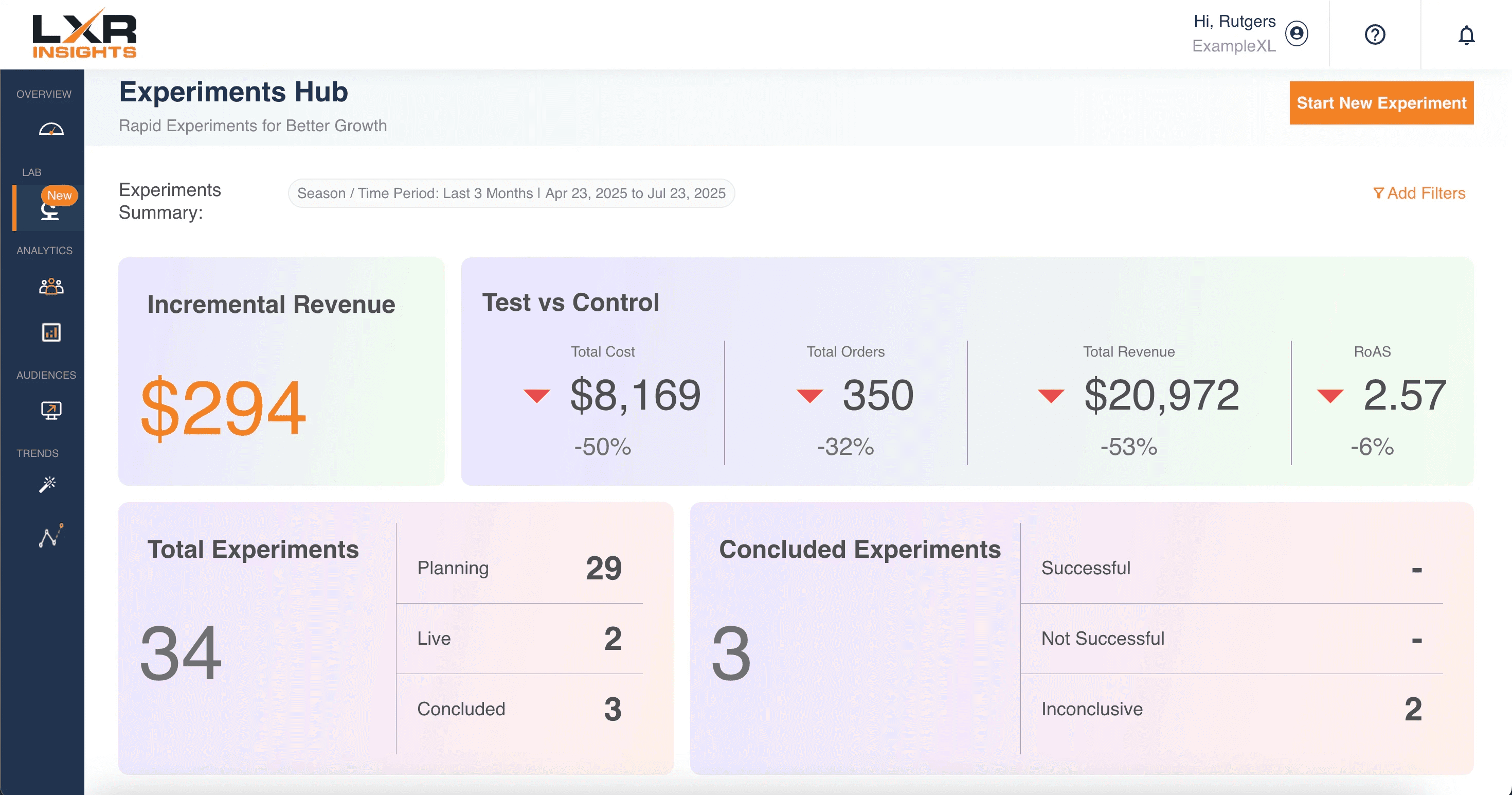
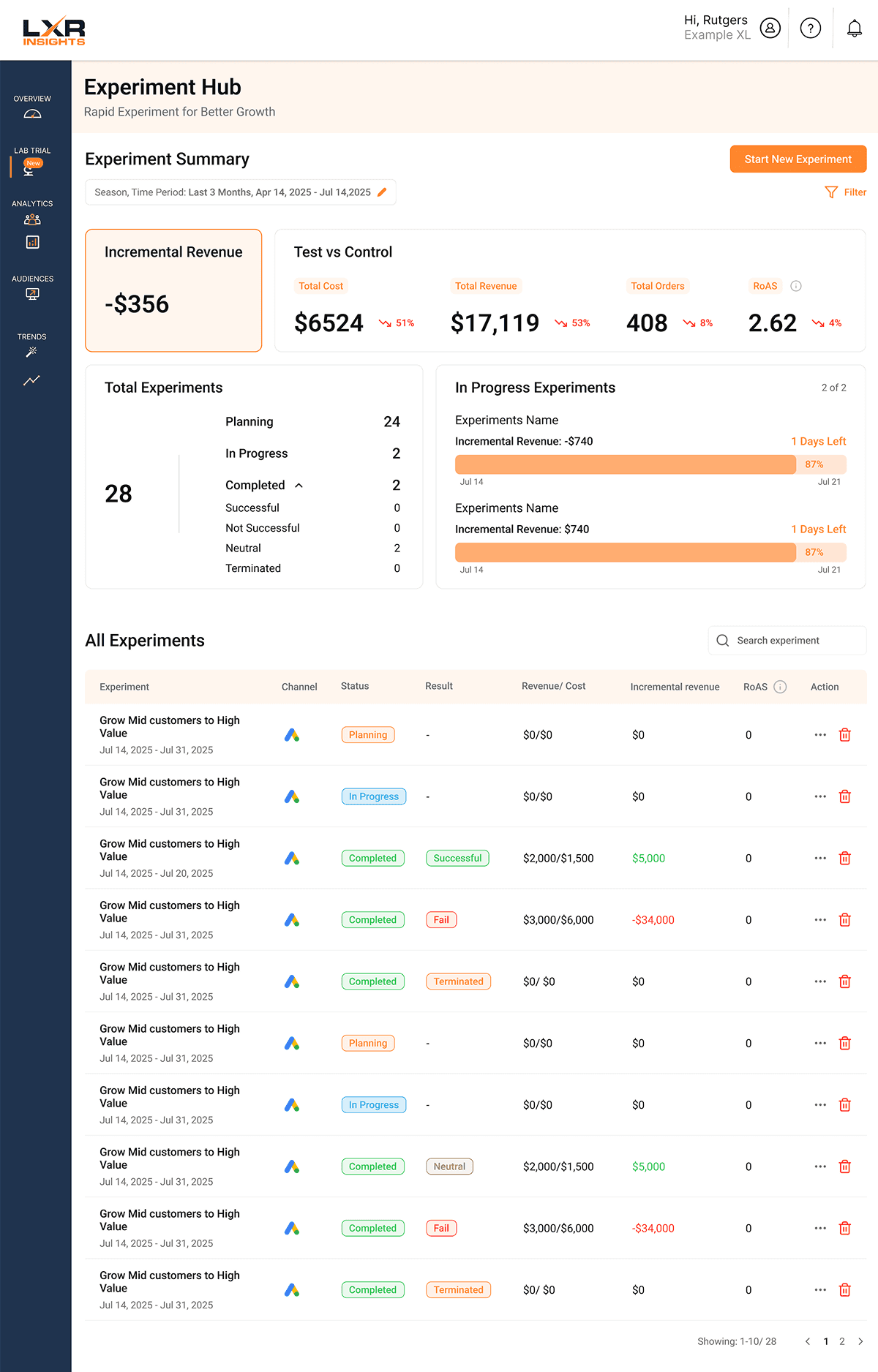
Applied progressive disclosure in the “Start New Experiments” flow to make onboarding clearer and easier to navigate. Created a hi-fidelity prototype for user testing, improving user flow and reducing task completion time by 37% when tested on users.
Step 2
Streamlined Reporting & Insights
Combined “Total Experiments” and “Concluded Experiments” into a more efficient reporting view, while introducing “In-Progress Experiments” and “Key Insights” for better experiment tracking.
Step 3
Enhanced Visuals & Interaction
Redesigned line charts and the overall interface for a cleaner experience, added visual status/result tags, and introduced an action row to simplify user interactions.
Original Page
Our Redesign


Step 1
Simplified Onboarding
Applied progressive disclosure in the “Start New Experiments” flow to make onboarding clearer and easier to navigate. Created a hi-fidelity prototype for user testing, improving user flow and reducing task completion time by 37% when tested on users.
Step 2
Streamlined Reporting & Insights
Combined “Total Experiments” and “Concluded Experiments” into a more efficient reporting view, while introducing “In-Progress Experiments” and “Key Insights” for better experiment tracking.
Step 3
Enhanced Visuals & Interaction
Redesigned line charts and the overall interface for a cleaner experience, added visual status/result tags, and introduced an action row to simplify user interactions.
Original Page
Our Redesign


Step 1
Simplified Onboarding
Applied progressive disclosure in the “Start New Experiments” flow to make onboarding clearer and easier to navigate. Created a hi-fidelity prototype for user testing, improving user flow and reducing task completion time by 37% when tested on users.
Step 2
Streamlined Reporting & Insights
Combined “Total Experiments” and “Concluded Experiments” into a more efficient reporting view, while introducing “In-Progress Experiments” and “Key Insights” for better experiment tracking.
Step 3
Enhanced Visuals & Interaction
Redesigned line charts and the overall interface for a cleaner experience, added visual status/result tags, and introduced an action row to simplify user interactions.
Original Page
Our Redesign
Predictions Page Solutions

Step 1
Information Architecture
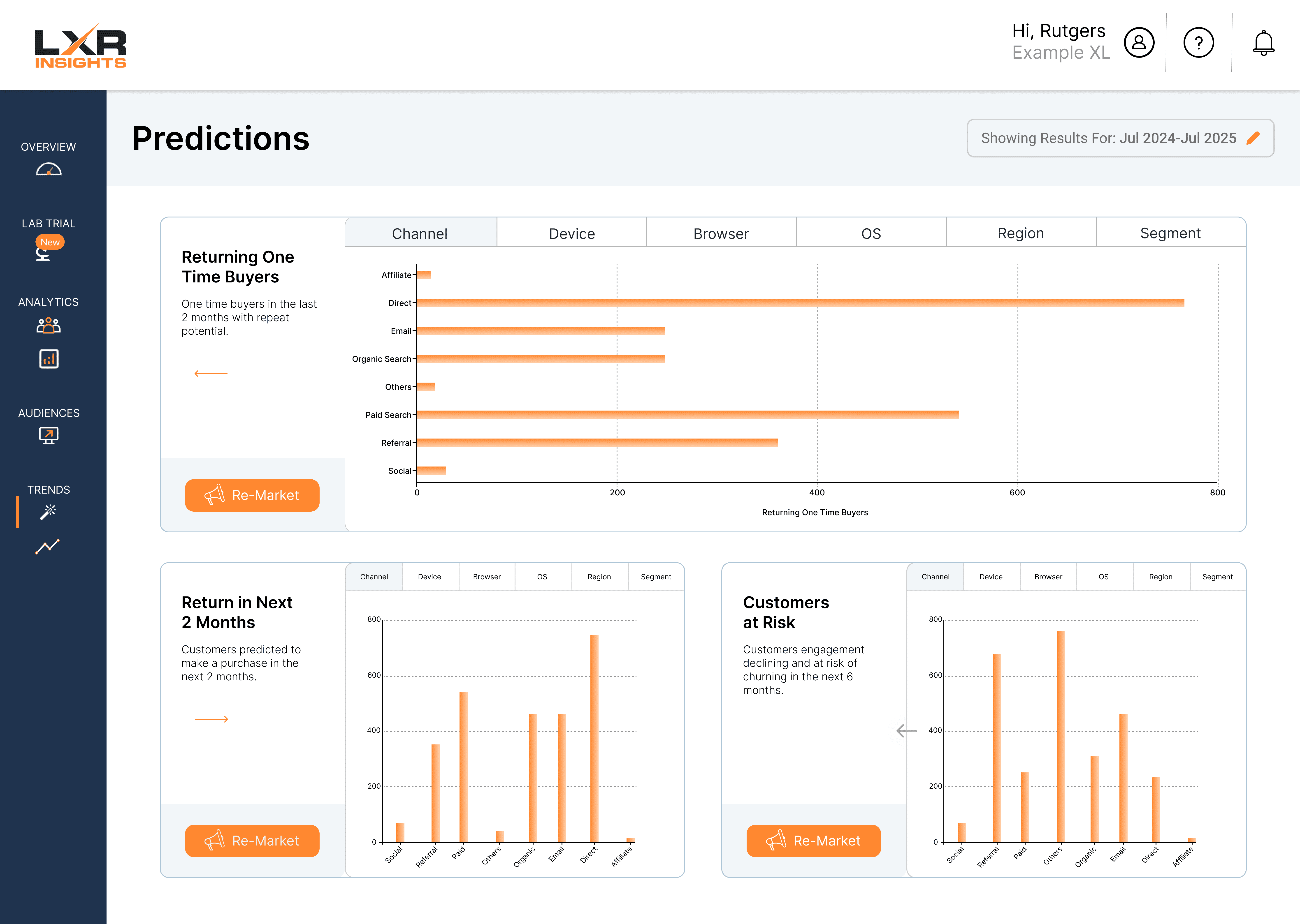
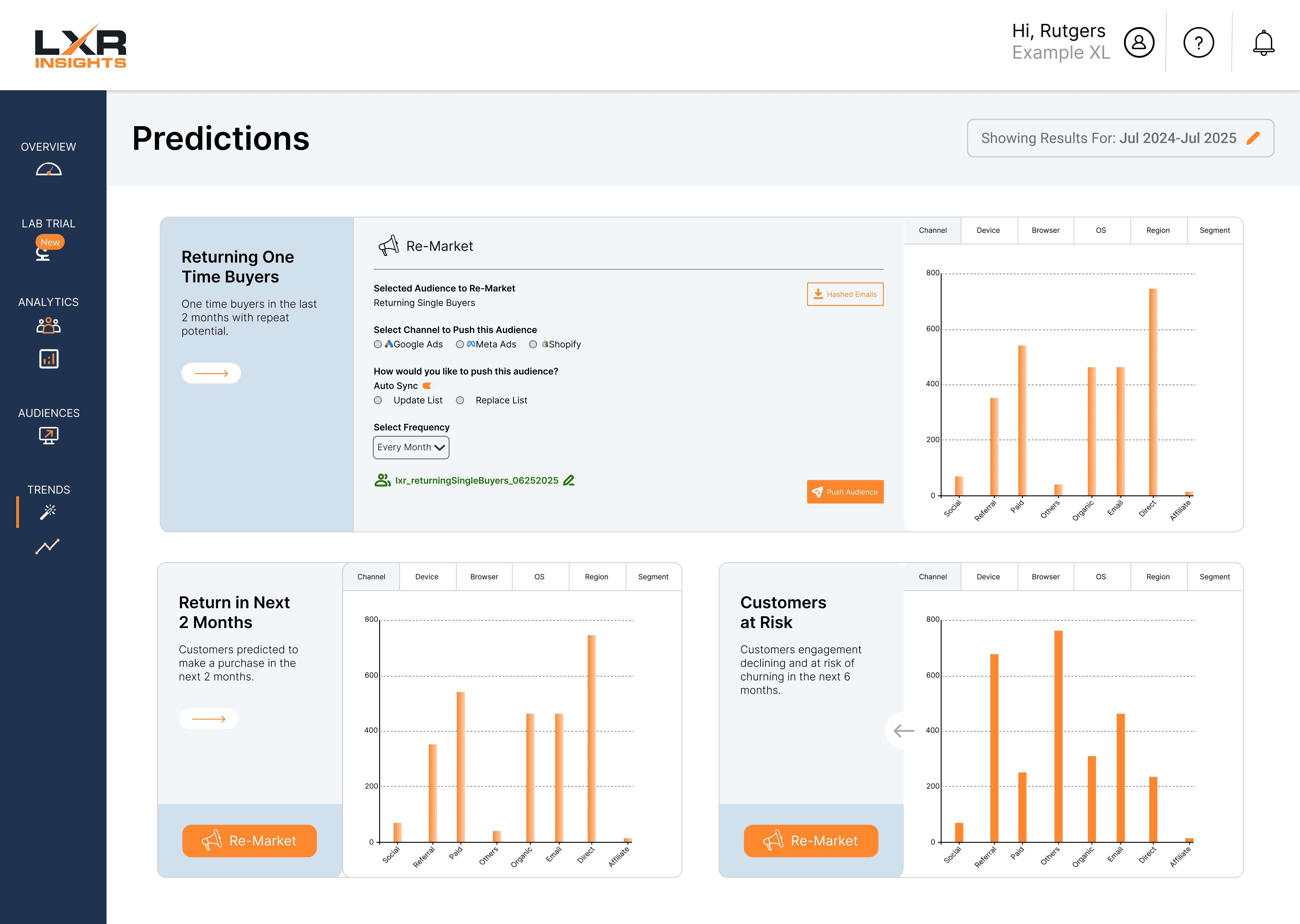
Redesigned the data layout using structured flows and accordion components to support both quick scanning and deeper exploration of information.
Step 2
Unified Visual Design
Aligned visual patterns, typography, and overall structure with the home page and broader product design system while optimizing the layout to scale cleanly across three balanced sections. Two options of color layouts.
Step 3
Interaction & Usability
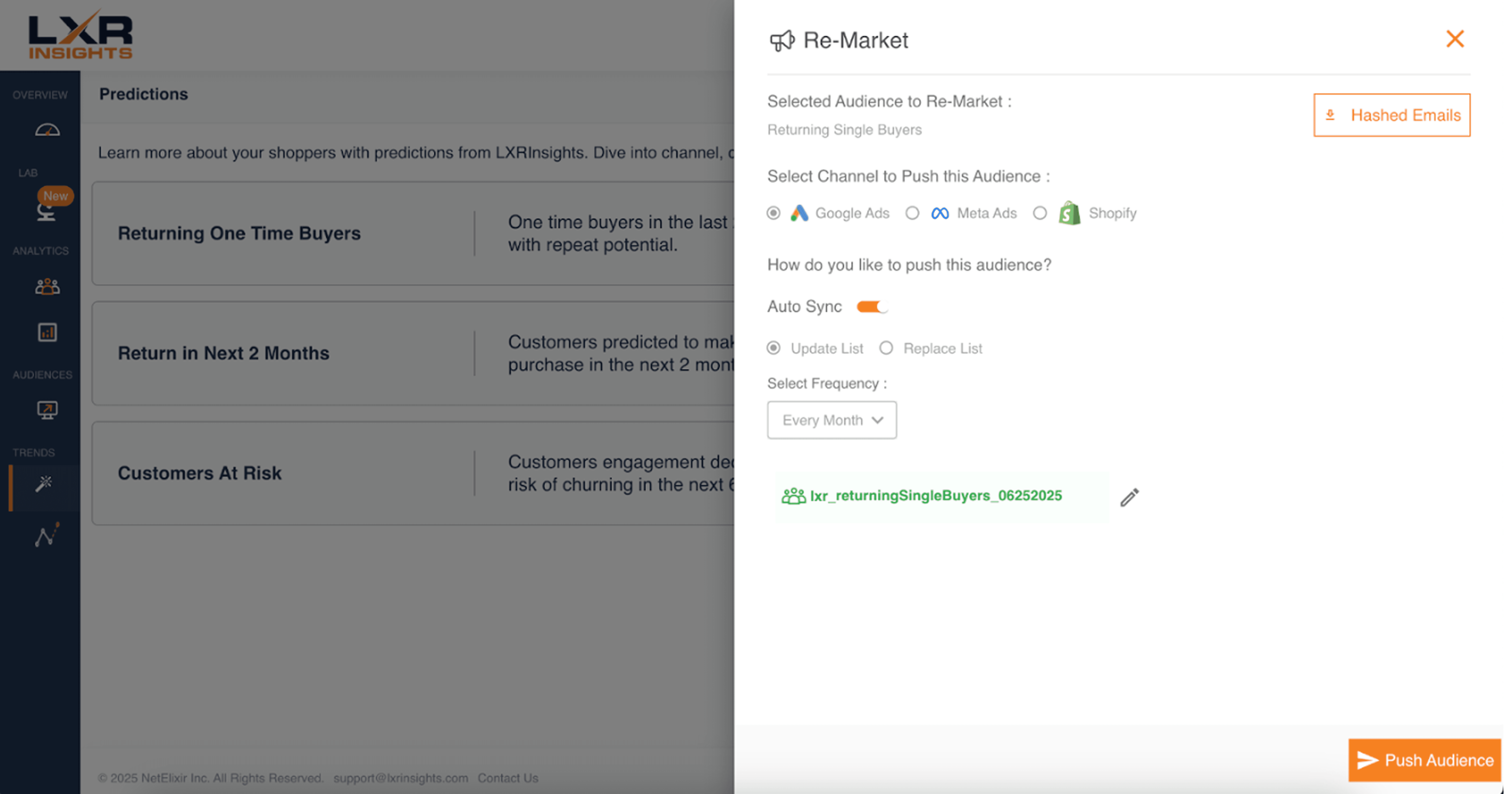
Integrated the “Re-Market” section directly into each information container, added clearer graph labeling, and tested multiple color sets and arrow button styles to evaluate usability and visual preference.


Original Page
Our Redesigns

Step 1
Information Architecture
Redesigned the data layout using structured flows and accordion components to support both quick scanning and deeper exploration of information.
Step 2
Unified Visual Design
Aligned visual patterns, typography, and overall structure with the home page and broader product design system while optimizing the layout to scale cleanly across three balanced sections. Two options of color layouts.
Step 3
Interaction & Usability
Integrated the “Re-Market” section directly into each information container, added clearer graph labeling, and tested multiple color sets and arrow button styles to evaluate usability and visual preference.


Original Page
Our Redesigns

Step 1
Information Architecture
Redesigned the data layout using structured flows and accordion components to support both quick scanning and deeper exploration of information.
Step 2
Unified Visual Design
Aligned visual patterns, typography, and overall structure with the home page and broader product design system while optimizing the layout to scale cleanly across three balanced sections. Two options of color layouts.
Step 3
Interaction & Usability
Integrated the “Re-Market” section directly into each information container, added clearer graph labeling, and tested multiple color sets and arrow button styles to evaluate usability and visual preference.


Original Page
Our Redesigns